How can Counsel Leverage Graphic Design Principles to Increase the Effectiveness of their Visual Advocacy?
This article was featured in our 2023 Construction Arbitration Report, which is part of a series of industry-focused arbitration reports edited by Jus Connect and Jus Mundi.
This issue explores the construction industry and presents a goldmine of information based on data available on Jus Mundi and Jus Connect as of May 2023. Discover updated insights into construction arbitration and exclusive statistics & rankings, as well as in-depth global and regional perspectives on construction projects, disputes, & arbitration from leading lawyers, arbitrators, experts, arbitral institutions, and in-house counsel.
THE AUTHOR:
Becca Shieh, Director of Litigation Strategy at Dubin Research and Consulting (DRC)
International arbitration lawyers are often tasked with explaining a complicated set of facts and legal arguments to an audience with varying languages, backgrounds, and levels of understanding. In construction arbitration, these challenges are even more pronounced due to the technical nature of the dispute and the complexity and density of the factual record. To overcome these challenges, lawyers need to make use of all tools that enable them to present information in a way that is accessible, easy-to-understand, and memorable. This is where effective demonstrative aids and trial graphics become invaluable assets.
In the United States, trial graphics are an essential part of a litigator’s toolbox and are often employed to help simplify complicated topics for a lay jury. Despite this, demonstratives tend to be underutilized in international arbitration cases. This is perhaps due to the belief that lawyers—which often act as the tribunal members—are auditory learners and have a high level of sophistication that makes visual graphics unnecessary. However, by failing to employ such tools, an attorney misses out on a crucial opportunity for visual advocacy.
The Benefits of Effective Visuals
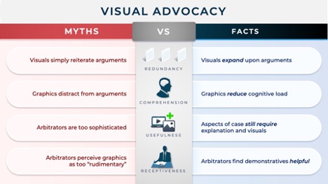
It is well-known that visual graphics can be used to improve attention, comprehension, retention, and recall of information (See, e.g., Mayer, R. E., & Gallini, J. K. (1990). When is an illustration worth ten thousand words? Journal of Educational Psychology, 82(4), 715–726, https://doi.org/10.1037/0022-0663.82.4.715). However, what is often overlooked is the fact that visuals do not simply reiterate an argument, they expand upon it. In other words, effective visual graphics can provide an additional dimension to an argument that verbal explanations alone cannot offer. Consequently, demonstrative aids are not redundant, they are additive.
This is perhaps best illustrated with quantitative data. Most appreciate that it is less effective to verbally communicate statistics than to use data visualizations such as charts, which help viewers identify patterns and trends in the data. Such benefits can be derived from more abstract demonstratives as well. Still, lawyers are often concerned that sophisticated graphics will be perceived as “flashy,” thereby distracting from the core arguments, or imply that the arbitrator requires the use of “rudimentary” educational tools to grasp the arguments.
However, the reason visual aids are effective is because they reduce cognitive load, not increase it. Instead of simply relying on an auditory stimulus, the information recipient is able to use both audio and visual processing systems when intaking new information (See, Sweller, John, Van Merrienboer, Jeroen J. G., Paas, Fred, “Cognitive Architecture and Instructional Design” Educational Psychology Review). Further, although arbitrators are more sophisticated than a lay jury, they might not be as well-versed as the parties in the facts, the technical issues, or (should an engineer or architect be nominated as arbitrator) the law. As such, even when presenting to a judicial panel, there is likely still a knowledge differential that can be bridged by the use of effective visuals.
Consistent with this, arbitrators have embraced rather than rejected the use of visual aids. In a survey of American Arbitration Association Construction Arbitrators, when asked “Do graphics and other forms of demonstrative evidence assist you in arriving at an appropriate award?” 89% of the arbitrators answered “yes” (See, Thomson, Dean B. (1994) “Arbitration Theory and Practice: A Survey of AAA Construction Arbitrators,” Hofstra Law Review: Vol. 23: Iss. 1, Article 2). When asked their “opinions on advocacy techniques,” arbitrators indicated that they preferred advocates to incorporate multimedia and visual graphics over “simple, direct, straightforward” presentations.
Opportunities for Visual Advocacy
For these reasons, counsel should look for opportunities to maximize their visual advocacy rather than shy away from it. Some examples of where graphics can be leveraged include when counsel wants to:
Establish Timing
Construction disputes can often have a complex and technical factual record referencing many more documents than in a typical dispute. Timing-based visual advocacy can help illustrate the frequency of a certain event, such as the number of times a party provided notice or rejected changed terms or work defects. It can also include illustrations of the relative timing of different events, or how key barriers increased the project timeline (both of which can establish causation).

Recreate Native Files
Certain pieces of evidence—such as Excel files, websites, or software information (like from Primavera)—may be too large to display all at once on a typical screen. Demonstratives can recreate a more user-friendly “scrolling” experience to help the viewer navigate such pieces of evidence. Computer-aided design images can be brought to life through the use of blowout diagrams and cutaway demonstratives.

Explain Contractual Language
Construction disputes can often refer to specialized forms of contract unknown to those not involved in construction. Demonstratives can be used to pace the relevant language of the contract, highlight definitions of jargon, and incorporate relevant regional and national cultural nuances. They can also be used to animate amendments to show the progression of the contractual language over time.

Designing for Visual Persuasion
Once an advocate has identified an opportunity for visual advocacy, they should consider how to best leverage the principles of information design to maximize the efficacy of their graphic. Whether a demonstrative is well-designed will often determine whether the visualization obfuscates or enhances the arguments being presented.

An exhaustive discussion of design principles is beyond the scope of this article. However, there are a few key points to keep in mind when designing for effective visual advocacy.
Tip #1: Identify the Goal of the Visualization
Before beginning to design a visualization, advocates should first be able to concisely articulate the message they want to convey. This will inform the use of color, the placement of visual elements, and other design choices. To avoid information overload, one should try to limit each visualization to one point.
Tip #2: Use Gestalt Principles to Imbue Meaning
After determining the visual message, the advocate should then consider what visual patterns will best support that message. Here, Gestalt principles can help determine the most effective graphical approach. Gestalt psychology focuses on how we perceive and interpret visual information. Gestalt theory proposes that our brains naturally group and organize visual elements into cohesive wholes or patterns, rather than perceiving them as isolated parts.
There are several principles associated with Gestalt theory, which help explain what people see when they look at visualizations. These principles include:

Similarity, which refers to the principle that similar items are perceived as a group.
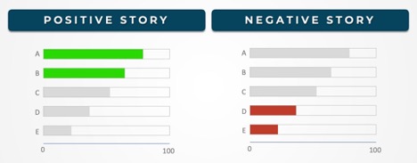
One can use similarity to suggest a connection between design elements that may not be in close proximity. Similarity can also be used to create contrast, drawing attention to key points (e.g., having all elements color-coded blue, except for the focal point, which is red).

Proximity, which refers to the principle that objects that are close together are perceived as a group.
One can use proximity to suggest that two elements are related or use the lack of proximity to show that they are not.

Figure / Ground, which refers to the principle that objects are perceived as either being part of the figure (the focal point) or ground (the background).
This principle comes into play when you want to focus the viewer on a section of a document by showing a magnified screenshot of just that section while the rest of the document fades into the background.
Tip #3: Highlight Key Points With Pre-attentive Attributes
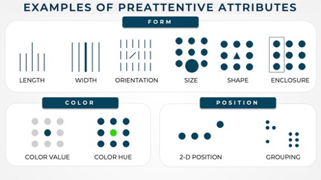
The chosen patterns can then be created by thoughtfully selecting the appropriate “pre-attentive attributes”. Pre-attentive attributes—such as color, orientation, length, intensity, size, and shape—are features of visual stimuli that are processed unconsciously and rapidly by the brain. When used sparingly, pre-attentive attributes can: (1) help establish focal points; and (2) create a “visual hierarchy” of elements by emphasizing and de-emphasizing certain elements.
Tip #4: Reduce Visual Clutter
Finally, once the first draft is complete, the advocate should audit the graphic for visual clutter. “Clutter” refers to visual elements that increase cognitive load but do not increase understanding. This does not simply mean having too many elements on the slide; it also encompasses situations when there is a lack of intentional design. For example, lack of visual order is a form of clutter, as is the non-strategic use of contrast (e.g., having a lot of different colors, sizes, or shapes that do not efficiently drive forward the message).
Conclusion
Demonstrative aids are powerful tools that help lawyers articulate their message and persuade arbitrators. With thoughtful design choices and strategic implementation, these tools can transcend mere bullets and become a form of visual advocacy that will help attorneys make their case more efficiently and persuasively than before. By incorporating more effective visual aids, advocates can better communicate complex ideas, enhance understanding, and ultimately achieve better outcomes for their clients.
ABOUT THE AUTHOR
Becca Shieh is the Director of Litigation Strategy at Dubin Research and Consulting (DRC) in New York. Becca joined DRC after working in the disputes group of an international law firm, where she had a broad practice in international arbitration, litigation, and investigations. As a Director at DRC, Becca has provided trial strategy consulting and demonstratives services in a broad variety of high-profile cases involving technology, media, election solutions, cryptocurrency, retail, pharmaceutical, and medical companies.
Find more data-backed insights in our 2023 Construction Arbitration Report


![[Template to duplicate] Article with Subtitle #5](https://dailyjus.com/wp-content/uploads/2026/02/article-collab-JM-Katy-Patrick-1-120x86.jpg)

